Friday, March 21, 2014

Wedding Box **Paper House** Blog Hop

This weekend, we're hosting a Wedding Blog Hop with our Spring Design Team! We challenged them to come up with their best wedding projects using our new "To Have & To Hold" Collection, and we were simply blown away with what they came up with!

Paper House Wedding Blog Hop


We can't wait to share all their projects with you. To celebrate the hop, we're giving away an extra special "Wedding Mega Collection" that includes a gorgeous Paper Pad, our best Bridal 3D Stickers, Chalkboard Stickers, and even new Canvas Stickers (plus much more! Valued at over $60, you'll definitely want to enter to win this great prize!
 
To Have & To Hold Collection

There's a few ways to enter - the first two are freebies by liking us on Facebook and signing up to receive Facebook notifications from us (we don't want you to miss any of our great project posts!). But the big entry comes from commenting on each of our designers' posts! If you do (and there's only 8 to hop through), you'll get +10 entries into our drawing! That sounds like a deal!

Wedding Blog Hop Designers

Make sure to hop through each designer down the list to be eligible for the most entries! When you're done, just hop back here and let us know! The hop will be running all weekend, so you have until Sunday at 11:59pm EST to get  your entries in!

a Rafflecopter giveaway

Here is my take on "To Have and To Hold" collection

Weddings are so special and for a wedding present given to the new couple, as a special gift the bride can give to her groom, parents, wedding party, or as the wedding favor given to guests something handmade and from the heart always is appreciated.  I made this box as a gift that could be given to anyone during a wedding event.  It could hold a gift card, a small present like jewelry, plane tickets, or any other wonderful gifts given to someone during a wedding.
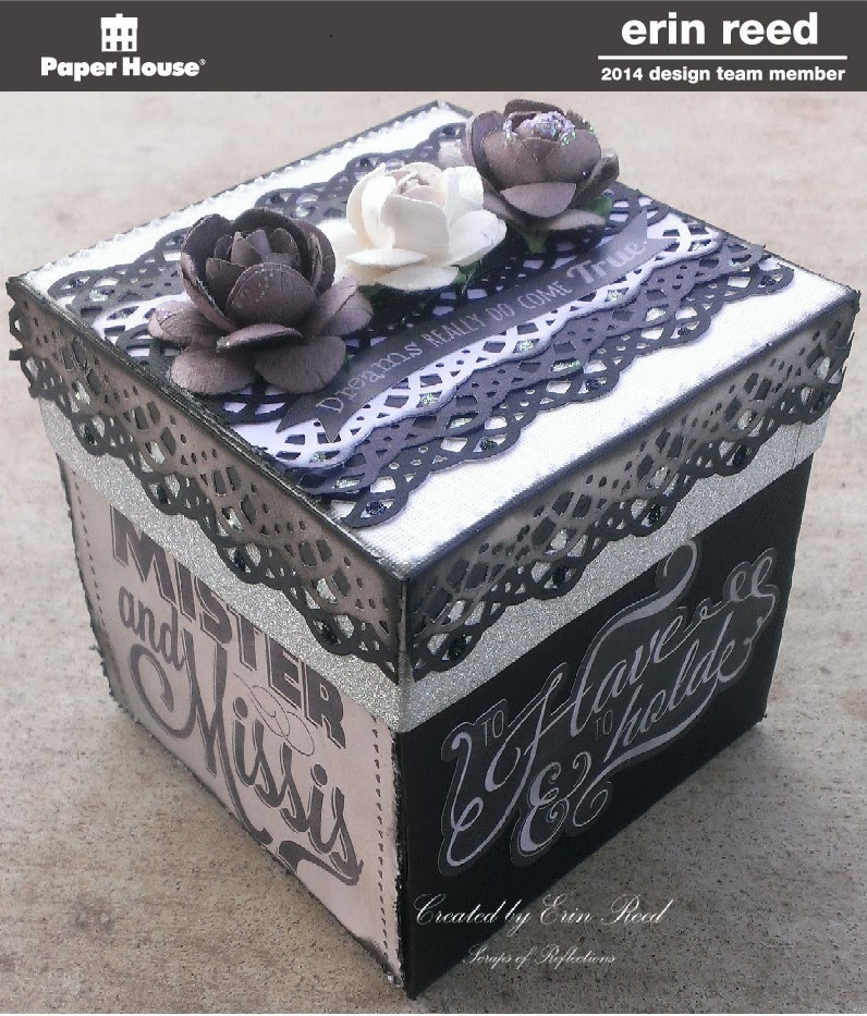
 
I created a box using 12x12 black cardstock and 8x8 white cardstock with the following template and dimensions.  I used my 3M tape runner to hold the box together, but red line sticky tape would work great too.  Make sure you use thick card stock so the box is sturdy, thin paper does not make a good box.


Base of the box: Black Cardstock
Size of paper - 10-1/2" x 10-1/2" 
Score and cut 3-1/4" according to template

Lid of Box: White Cardstock
Size of paper - 6-1/8" x 6-1/8"
Score and cut at 1" according to template.


I used the wonderful paper line "To Have & to Hold" by Paper House Production on my box.  I cut out 3 tags all about 3 inches in width from the tag paper and adhered them to the sides of the base of the box.  I then added one sticker to the 4th side from the sticker sheet.


For the lid of the box I used card stock in shades of grey, black, white and used a edge punch to create the lacy pattern.  I layered the top starting at the bottom with black, grey, white, and then black cardstock.  I finished it with 3 Prima flowers, a sticker from Paper House "To Have & to Hold" sticker sheet, and some black crystal and white crystal stickles.


For the sides of the lid I layered two different tones of grey cardstock punched the the same edge punch and layered on top of some silver washi tape I put on the edge of the lid, same color of stickles added along the sides.  I also used the same silver washi tape along the top edge of the base of the box to give them a clean edge. 


Creating a hand made item for a friend, especially for a wedding is something people treasure and love.  Weddings are moments to remember, and this box is sure to hold many memories for year to come.

Supplies Used
Cardstock: Core'dinations
Flowers: Prima
Stickles: Ranger
Punch: Martha Stewart

Enjoy!!

Friday, March 14, 2014

Off the Rails Scrapbooking Blog Hop!!

Hey everyone - Off the Rails is having their first Blog hop - and along the way you can find some wonderful prizes!!  Some prizes come from the main blog and some come from individuals - so make sure you check everyone out!!

http://offtherailsscrapbooking.blogspot.com/

The Rules to Qualify for the Prize
  1. Blog Hop starts today and ends midnight March 21st, US EST
  2. You need to create one (1) layout/card/project using 4 of the DT's favorite embellishments and link it to the Off the Rails blog, 
  3. On your post with your project please state what 4 embellishments you are using and who's DT blog you got it from.
  4. You must follow both Off The Rails and all of the DT members blogs (13 in total)
  5. Leave a comment on the Off the Rails blog to state that you are finished the blog hop letting us know what you like about Off the Rails and what you want to see in the future
My project is a layout I made of  myself and my husband when I was 17 weeks pregnant with our youngest.  We went to a military ball about 5 months before he deployed and had this picture taken of us.  One of the only times we have a dressed up picture of us with my husband in his military uniform.
 

My favorite item I used on this layout are BRADS.  I love to add brads, they are so verisitle and I have so many of the little suckers.  You can use any color, shape, pattern, or size you like.  Mine are located to the right of the journaling.  They are the decorative type to match the MME paper line Lost and Found as seen below.


So now you can follow the blog along to the next person in the line - I have listed the entire hop for your convenience and if you get lost you can always hope back to the beginning to find your way.

1. Off the Rails Scrapbooking http://offtherailsscrapbooking.blogspot.com/
2. Narelle Fasulo  - Flowers   www.enchantedcreationsnf.blogspot.com.au
3. Deena Otway - Buttons - http://deezignerpapercraft.blogspot.com.au/
4. ME - Erin Reed - Brads  http://scraps-of-reflections.blogspot.com
5. NEXT - Diana Rivero Gonzalez - Flowers - http://itsmylifeandimscrappingit.blogspot.com/

6. Carol Theng - Chipboard shape - www.carolpaperie.blogspot.sg
7. Gayle Gordon - Bling - http://www.baggiesplace.blogspot.com.au/
8. Fiona Paltridge - Shrinky Dinks - http://pastichescrapbookstudio.blogspot.com.au
9. Felicity Wislon - http://herhand.blogspot.com.au/
10. Sue Plumb - Doilies  -  http://soupie75.blogspot.com.au/
11. Rose Andrew - Tags -  http://www.cardsforallreason.blogspot.com
12. Jelissa Mei - Chipboard -  http://jelibeanz.blogspot.com.au/
13. Wendy O'Keeffe - washi tape -  http://scrapbookingandmixedmediabywendy.blogspot.com.au/
13. Catie Kennedy - Twine - www.catiescraftcorner.blogspot.com.au/

Enjoy!!
 

Friday, March 7, 2014

simple things **Susan K. Weckesser**

I love to create texture and depth in my layouts.  I don't always want them bulky, but I want the illusion of richness and intrigue.  Here I will explain a few tips on how to add texture and depth using clustering and layering on your projects without added in tons of bulk, plus you might think about your supplies you already have in a different light and sue them in a different way.  

This is a layout of my family, it is a simple day fishing at a lake.  I love the picture because it shows my boys in the back ground fishing with my husband and daughter watching them, of course fishing as well.  I used a filter on the picture through Instagram called Walden, it gave the picture a softer feel, more like nature.  I have found that having a great picture to start with when making a layout, versus a picture you kind of like but "need to scrap" makes a world of difference.  The picture gives me the inspiration I need and the page just comes more naturally instead of fighting with the need to "just get this page done".

 
I wanted to have the same feel in my layout, so the first step was to pull items that worked with the color scheme of the picture, the browns, greens, the feel of nature.  I picked out items that had texture to them already like the mesh flowers, the chipboard, the wooden items, cork, and the fibers.  Using items that already have their own texture gives your projects more depth and richness without even having to try.


Here is a list of a few things to the edges of the papers in your projects to add texture and dimension without adding bulk to the layout.

  1. Distress the edges of the paper with a distressing tool like your scissors and ink the edges.  I do this technique to tons of projects.  It adds a softness to the look and takes away all the white lines from the papers you just cut.
  2. Take an edge punch and randomly punched the edges, not really caring that the punches were aligned or even that the paper looks like like the punch.  I did this the tan paper all around the edge of the layout and also to the darker brown paper placed vertically behind the cluster.  Just a pop of each paper is visible, so it adds just a hint but that little touch add so much.  
  3. Add in grainy texture by applying a quick drying glue (like ZipDry) around the edges of the papers and layers and sprinkle on flower soft.  I used a light brown color.
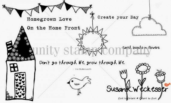
  4. Take some phrase stamps like those from Susan K. Weckesser saying "Create your Day" and "Don't go through life, grow through life" and stamp around the edges of the paper and at corners of strips in the foundation of the cluster.


http://www.susankweckesser.com/welcome


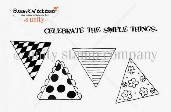
Here I used a wonderful stamp by Susan K. Weckesser that just captures the feelings the day "Celebrate the Simple Things"
http://www.susankweckesser.com/welcome


Here you can see some other texture applications I used in the cluster to add interest.
  1. Paint Splatters
  2. Stamps
  3. Layers of paper
  4. Inked edges of paper
  5. Distressed edges of paper
  6. Metal bits
  7. Crackle paint on chipboard
  8. Flower soft
  9. Rubons
  10. Items with texture already like the flowers and the jute.
  11. Mists
  12. Paint Splatters


Don't be afraid to try out an item in a new way or add things together to create something new.  Layers of papers mixed with other items add such a wonderful depth to your projects.  I have been told before and I fully believe there are no mistakes in scrapbooking just chances to expand your creativity!! 

Supplies Used
Cardstock - Core'dinations
Patterned Paper - Prima
Number Stickers - Glitz
Rubons - BoBunny
Jute - Canvas Corps
Flowers - Petaloo
Wood - Prima
Chipboard - Memory Maze
Metal - Prima
Cork - Fancy Pants
Stamps - Susan K. Weckesser
Ink - Ranger
Punches - EK
Stains and Mediums - Ranger

You can also view this article at Susan K. Weckesser.

Enjoy!!
http://scraps-of-reflections.blogspot.com/

Thursday, February 20, 2014

happy **Susan K. Weckesser**

I love to use flowers and girly things on my cards and projects, but sometimes I want something more masculine, especially if it's for my husband.  I find that a great substitute for flowers are gears, and there are so many varieties out there in chipboard, acrylic, stamps, stickers, and punches.  So here is a card I made for his birthday this year.


I am loving paint splatter right now, I seem to be using them in just about every project, but they really add to the dimension and depth to your paper for very little effort and cost.  I then on top of the splatters used some of Susan K. Weckesser stamps around the edges and borders of the card for more dimension and texture.  I kept to earth tone colors for a rustic look, I felt that it just added to the masculine feel.


I was not happy with any of the alpha letters I had on hand, they were not the correct size, wrong color, wrong font, etc.  So I took something that I like the size and font and altered the color.  These were foam "Thickers" in grey.  I pressed my distress ink by Ranger in a dark brown on top to give it a darker look and distress the letters a bit.


Here you can see some of Susan K. Weckesser stamps up close.  I used the "banner" and the "create your day" stamps.
http://www.susankweckesser.com/welcome


I love Susan K. Weckesser papers.  The a fun, flirty, and whimsical.  I took a small section of one of her papers to make these banners. 
http://www.susankweckesser.com/welcome


Play with your stamps and inks.   You can get such wonderful results by layering and just letting your project go where it needs to go.

Supplies Used"
Papers - Susan. K Weckesser and Core'dinations
Stickers - Glitz and American Crafts
Ink and stain - Ranger
Stamps - Susan K. Weckesser
Chipboard - Creative Embellishments
Twine - May Arts Ribbon
Staples - Ranger

Enjoy!!

Wednesday, February 12, 2014

Love Card **The Art Studio @ SNR**

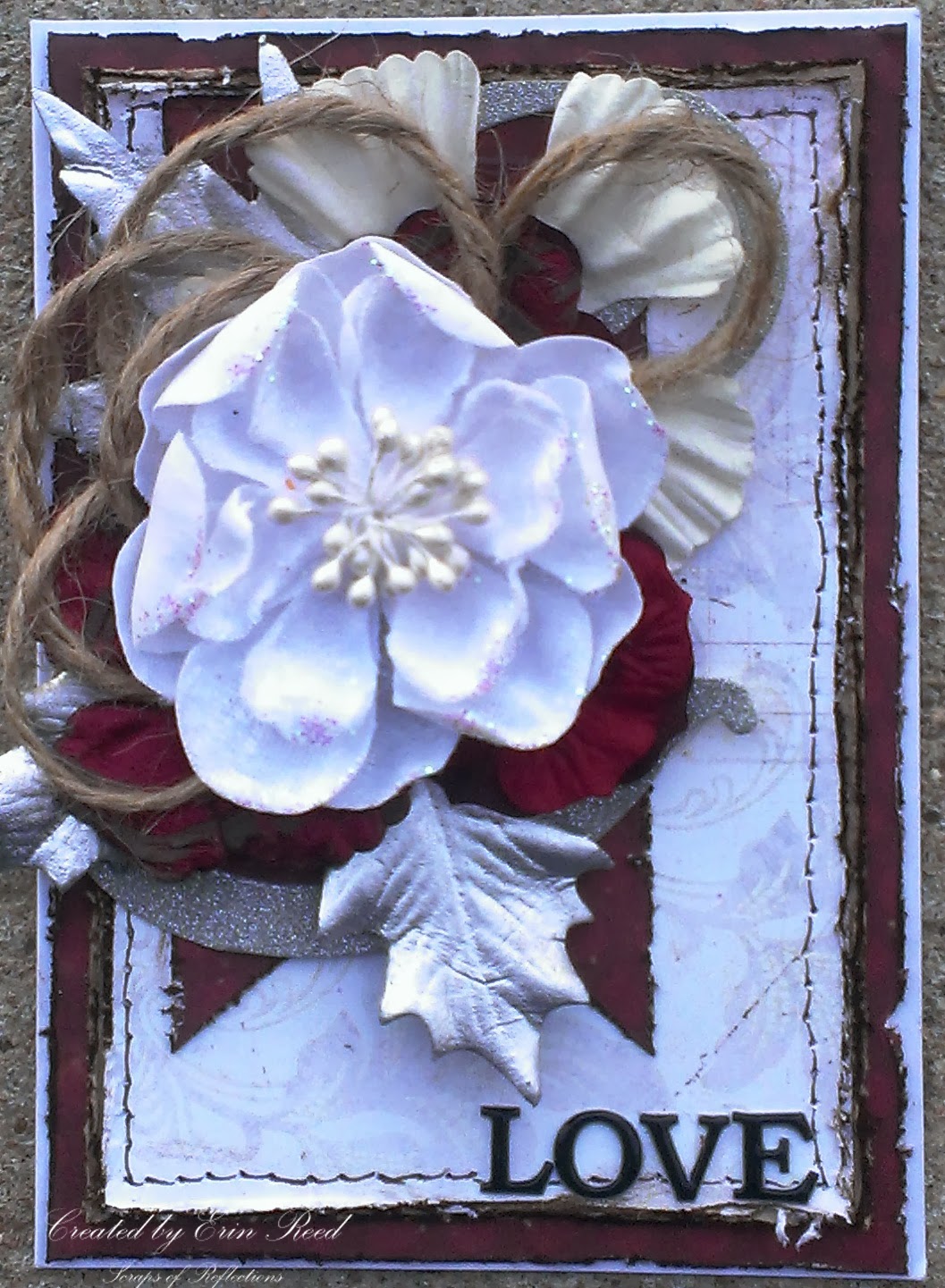
I have always been in awe of layouts and cards with wonderful layering and groups (or clustering) of items such as flowers, chipboard, trims, leaves and the like; so I have created many projects teaching myself how to create this same wonderful effect.  On this card, that I made for my parents anniversary, I will show you the thought process of putting together a cluster of flowers, jute, and leaves - a peak into the thought process of cluster creation.


First, start with the colors.  The wedding colors (as this is an anniversary card) were red, white, and silver, therefore the colors of the card came naturally.  I cut all the papers to size, distressed the edges with my scissors, and then inked them with dark brown distress ink.  I used a faux stitching technique with my pen around the white paper, and then glued everything down to my card (A2 size) so as I worked out the idea for the cluster the papers would not move around.


I took a portion of a 12x12 die cut silver glitter paper and placed it on top of the red banner as the base for my cluster.  This way my cluster is not free floating on my card.  You want to anchor your cluster to something, the corner of a picture, along a swirl, the edge of layers, and not just free floating on your page or layout.  I started with my cluster with a bow tied in jute, this gives such texture and contrast to the cluster.


At this point I started playing with different flowers and leaves that I had pulled from my stash that were the colors for the card.  I had pulled about 20-30 different flowers and leaves so I had plenty to play with knowing full well that not all were going to make it to the final project.  I layer them on top of each other, play with where they are placed, see if it looks good, if not I move it around or stop using it all together.  None of the flowers, leaves, or jute are glued down in this process so I can play as much as I like.


At this point I am not liking the way the smaller white flower on top looks. There is too much red and the smaller flower looks swallowed up by the cluster.  I changed it to the larger white flower, and it looks tons better.


Now the ribbon jute looks to small, you can't even tell it is a bow.  I could either change the bow to a different type of trim or ribbon or change tactics.  I played around with the jute and looking back at the previous picture I liked the loopy feel of the bow at the top of the white flower.  I made more loops and place the flower on that, awesome!


Much better, the loopy jute looks great.  Another part that bugged me were all the red flowers grouped together, you could not tell there were three separate flowers since they were so close in color.  So I brought the larger white flower from the back up in front of two of the other red flowers to break it up.  I also added a brad to the smaller red flower to attach it to the large white flower to make them a unit, this made it much easier to arrange the cluster (less individual pieces shifting around).  At this point I take a picture with my phone (just a quick snapshot) to see what the final look will be so as I take it all apart and start to glue it all down (I used a good craft glue like Martha Stewart craft glue) I can see where each part goes, no guessing.


Head on over to The Art Studio @ SNR to see more great creations!! 
 http://theartstudio.scrapbooknewsandreview.com/index.php/cool-stuff/blog/entry/how-to-create-layers-and-clusters


Supplies
Cardstock - DCWV
Specialty Paper -  Imaginesance and CartaBella
Letter Stickers - Momenta
Embellishments - Prima and Canvas Corps
Ink - Ranger
Pen - Faber-Castell
Brad - Recollections
Adhesive - 3M and Martha Stewart

Enjoy!!
 

Tuesday, February 4, 2014

It's a Boy **Susan K. Weckesser**

 I have a baby shower that I am going to this weekend, and it is for a boy!!  I love to make handmade items for people on special occasions such as this, so here is my special card for such a special baby.
 

I just love the colors of teal, turquoise, tan, and white - it looks so clean and fresh, just what I think of new babies.  I had fun with all the layers and textures here, from die cuts to ribbon, flowers, chipboard, and Susan K. Weckesser Stamps.

http://www.susankweckesser.com/welcome

I used the horizontal line triangle stamp from the "Celebrate the simple things" stamp set by Susan K. Weckesser, stamped it in light brown ink on tan Core'dinations paper and then cut it out and place it in the background of the card.  I added a bit of twine from May Arts Ribbon across the top of the triangle banner and added little knots to the end.


I then took the "Create your Day" stamp from the below stamp collection by Susan K. Weckesser and stamped just the "your day" portion of the phrase around the card in random places, as it is the baby's day for he is about to be born (and also for his parents).

http://www.susankweckesser.com/welcome


Supplies Used
Cardstock - Core'dinations
Patterned Paper - Simple Stories
Punch - Martha Stewart
Die Cuts - Spellbinders
Inks/pearls/glitter - Ranger
Ribbon/Fibers - May Arts Ribbon
Chipboard - Memory Maze and Other
Stickers - Momenta
Flowers - Prima
Brad - Recollections
Stamps - Susan K. Weckesser

Enjoy!!

http://scraps-of-reflections.blogspot.com/

Monday, February 3, 2014

Thankful for You **The Art Studio @ SNR**

I am always on the lookout for uses for my mists - I just can't get enough of them.  I love the look and ease of application (you can't mess it up), plus it adds great dimension and depth to your project. 


Here I used two different types of papers to change the color or add color by using mists.

First is coffee filter paper.  It is exactly what it sounds like, a paper make of coffee filter material.  You can buy it as doilies or you can cut up real coffee filters and use those.  The absorb mists really well and don't harden up like regular scrapbook paper after it has gotten wet and dried.  On this filter paper i used varying colors of red, yellow, and orange.


Next I used corrugated paper, similar to cardboard, but it comes in a variety of colors.  This one started out as grey, but I wanted to liven it up so I misted it with red, orange, and yellow mists then brushed the top and edges with dark brown ink.


 I used both of these materials in the background of my card for texture and depth.  I love to layer and it is even more fun when I use my mists!!

Supplies Used
Cardstock - Core'dinations and DCWV
Patterned paper - Glitz
Specialty paper - Fancy pants
Embellishments (flowers and leaves) - Prima, Petaloo, and Recollections
Stamp - Inkadinkadoo
Ink - Studio G
Mists - Heidi Swapp and Dylusions
Ribbon - Canvas Corp and May Arts

Come check out more at The Art Studio @ SNR!!

Enjoy!!


Share This

Related Posts Plugin for WordPress, Blogger...