Thursday, February 20, 2014

happy **Susan K. Weckesser**

I love to use flowers and girly things on my cards and projects, but sometimes I want something more masculine, especially if it's for my husband.  I find that a great substitute for flowers are gears, and there are so many varieties out there in chipboard, acrylic, stamps, stickers, and punches.  So here is a card I made for his birthday this year.


I am loving paint splatter right now, I seem to be using them in just about every project, but they really add to the dimension and depth to your paper for very little effort and cost.  I then on top of the splatters used some of Susan K. Weckesser stamps around the edges and borders of the card for more dimension and texture.  I kept to earth tone colors for a rustic look, I felt that it just added to the masculine feel.


I was not happy with any of the alpha letters I had on hand, they were not the correct size, wrong color, wrong font, etc.  So I took something that I like the size and font and altered the color.  These were foam "Thickers" in grey.  I pressed my distress ink by Ranger in a dark brown on top to give it a darker look and distress the letters a bit.


Here you can see some of Susan K. Weckesser stamps up close.  I used the "banner" and the "create your day" stamps.
http://www.susankweckesser.com/welcome


I love Susan K. Weckesser papers.  The a fun, flirty, and whimsical.  I took a small section of one of her papers to make these banners. 
http://www.susankweckesser.com/welcome


Play with your stamps and inks.   You can get such wonderful results by layering and just letting your project go where it needs to go.

Supplies Used"
Papers - Susan. K Weckesser and Core'dinations
Stickers - Glitz and American Crafts
Ink and stain - Ranger
Stamps - Susan K. Weckesser
Chipboard - Creative Embellishments
Twine - May Arts Ribbon
Staples - Ranger

Enjoy!!

Wednesday, February 12, 2014

Love Card **The Art Studio @ SNR**

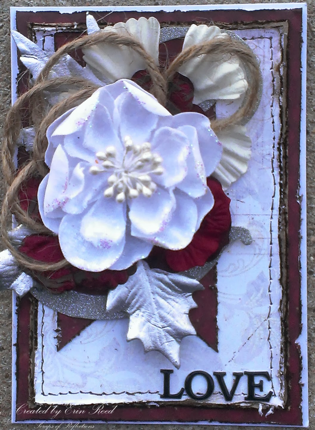
I have always been in awe of layouts and cards with wonderful layering and groups (or clustering) of items such as flowers, chipboard, trims, leaves and the like; so I have created many projects teaching myself how to create this same wonderful effect.  On this card, that I made for my parents anniversary, I will show you the thought process of putting together a cluster of flowers, jute, and leaves - a peak into the thought process of cluster creation.


First, start with the colors.  The wedding colors (as this is an anniversary card) were red, white, and silver, therefore the colors of the card came naturally.  I cut all the papers to size, distressed the edges with my scissors, and then inked them with dark brown distress ink.  I used a faux stitching technique with my pen around the white paper, and then glued everything down to my card (A2 size) so as I worked out the idea for the cluster the papers would not move around.


I took a portion of a 12x12 die cut silver glitter paper and placed it on top of the red banner as the base for my cluster.  This way my cluster is not free floating on my card.  You want to anchor your cluster to something, the corner of a picture, along a swirl, the edge of layers, and not just free floating on your page or layout.  I started with my cluster with a bow tied in jute, this gives such texture and contrast to the cluster.


At this point I started playing with different flowers and leaves that I had pulled from my stash that were the colors for the card.  I had pulled about 20-30 different flowers and leaves so I had plenty to play with knowing full well that not all were going to make it to the final project.  I layer them on top of each other, play with where they are placed, see if it looks good, if not I move it around or stop using it all together.  None of the flowers, leaves, or jute are glued down in this process so I can play as much as I like.


At this point I am not liking the way the smaller white flower on top looks. There is too much red and the smaller flower looks swallowed up by the cluster.  I changed it to the larger white flower, and it looks tons better.


Now the ribbon jute looks to small, you can't even tell it is a bow.  I could either change the bow to a different type of trim or ribbon or change tactics.  I played around with the jute and looking back at the previous picture I liked the loopy feel of the bow at the top of the white flower.  I made more loops and place the flower on that, awesome!


Much better, the loopy jute looks great.  Another part that bugged me were all the red flowers grouped together, you could not tell there were three separate flowers since they were so close in color.  So I brought the larger white flower from the back up in front of two of the other red flowers to break it up.  I also added a brad to the smaller red flower to attach it to the large white flower to make them a unit, this made it much easier to arrange the cluster (less individual pieces shifting around).  At this point I take a picture with my phone (just a quick snapshot) to see what the final look will be so as I take it all apart and start to glue it all down (I used a good craft glue like Martha Stewart craft glue) I can see where each part goes, no guessing.


Head on over to The Art Studio @ SNR to see more great creations!! 
 http://theartstudio.scrapbooknewsandreview.com/index.php/cool-stuff/blog/entry/how-to-create-layers-and-clusters


Supplies
Cardstock - DCWV
Specialty Paper -  Imaginesance and CartaBella
Letter Stickers - Momenta
Embellishments - Prima and Canvas Corps
Ink - Ranger
Pen - Faber-Castell
Brad - Recollections
Adhesive - 3M and Martha Stewart

Enjoy!!
 

Tuesday, February 4, 2014

It's a Boy **Susan K. Weckesser**

 I have a baby shower that I am going to this weekend, and it is for a boy!!  I love to make handmade items for people on special occasions such as this, so here is my special card for such a special baby.
 

I just love the colors of teal, turquoise, tan, and white - it looks so clean and fresh, just what I think of new babies.  I had fun with all the layers and textures here, from die cuts to ribbon, flowers, chipboard, and Susan K. Weckesser Stamps.

http://www.susankweckesser.com/welcome

I used the horizontal line triangle stamp from the "Celebrate the simple things" stamp set by Susan K. Weckesser, stamped it in light brown ink on tan Core'dinations paper and then cut it out and place it in the background of the card.  I added a bit of twine from May Arts Ribbon across the top of the triangle banner and added little knots to the end.


I then took the "Create your Day" stamp from the below stamp collection by Susan K. Weckesser and stamped just the "your day" portion of the phrase around the card in random places, as it is the baby's day for he is about to be born (and also for his parents).

http://www.susankweckesser.com/welcome


Supplies Used
Cardstock - Core'dinations
Patterned Paper - Simple Stories
Punch - Martha Stewart
Die Cuts - Spellbinders
Inks/pearls/glitter - Ranger
Ribbon/Fibers - May Arts Ribbon
Chipboard - Memory Maze and Other
Stickers - Momenta
Flowers - Prima
Brad - Recollections
Stamps - Susan K. Weckesser

Enjoy!!

http://scraps-of-reflections.blogspot.com/

Monday, February 3, 2014

Thankful for You **The Art Studio @ SNR**

I am always on the lookout for uses for my mists - I just can't get enough of them.  I love the look and ease of application (you can't mess it up), plus it adds great dimension and depth to your project. 


Here I used two different types of papers to change the color or add color by using mists.

First is coffee filter paper.  It is exactly what it sounds like, a paper make of coffee filter material.  You can buy it as doilies or you can cut up real coffee filters and use those.  The absorb mists really well and don't harden up like regular scrapbook paper after it has gotten wet and dried.  On this filter paper i used varying colors of red, yellow, and orange.


Next I used corrugated paper, similar to cardboard, but it comes in a variety of colors.  This one started out as grey, but I wanted to liven it up so I misted it with red, orange, and yellow mists then brushed the top and edges with dark brown ink.


 I used both of these materials in the background of my card for texture and depth.  I love to layer and it is even more fun when I use my mists!!

Supplies Used
Cardstock - Core'dinations and DCWV
Patterned paper - Glitz
Specialty paper - Fancy pants
Embellishments (flowers and leaves) - Prima, Petaloo, and Recollections
Stamp - Inkadinkadoo
Ink - Studio G
Mists - Heidi Swapp and Dylusions
Ribbon - Canvas Corp and May Arts

Come check out more at The Art Studio @ SNR!!

Enjoy!!


Share This

Related Posts Plugin for WordPress, Blogger...