I love to create texture and depth in my layouts. I don't always want them bulky, but I want the illusion of richness and intrigue. Here I will explain a few tips on how to add texture and depth using clustering and layering on your projects without added in tons of bulk, plus you might think about your supplies you already have in a different light and sue them in a different way.
This is a layout of my family, it is a simple day fishing at a lake. I love the picture because it shows my boys in the back ground fishing with my husband and daughter watching them, of course fishing as well. I used a filter on the picture through Instagram called Walden, it gave the picture a softer feel, more like nature. I have found that having a great picture to start with when making a layout, versus a picture you kind of like but "need to scrap" makes a world of difference. The picture gives me the inspiration I need and the page just comes more naturally instead of fighting with the need to "just get this page done".
I wanted to have the same feel in my layout, so the first step was to pull items that
worked with the color scheme of the picture, the browns, greens, the
feel of nature. I picked out items that had texture to them already
like the mesh flowers, the chipboard, the wooden items, cork, and the fibers.
Using items that already have their own texture gives your projects more
depth and richness without even having to try.
Here is a list of a few things to the edges of the papers in your projects to add texture and dimension without adding bulk to the layout.
- Distress the edges of the paper with a distressing tool like your scissors and ink the edges. I do this technique to tons of projects. It adds a softness to the look and takes away all the white lines from the papers you just cut.
- Take an edge punch and randomly punched the edges, not really caring that the punches were aligned or even that the paper looks like like the punch. I did this the tan paper all around the edge of the layout and also to the darker brown paper placed vertically behind the cluster. Just a pop of each paper is visible, so it adds just a hint but that little touch add so much.
- Add in grainy texture by applying a quick drying glue (like ZipDry) around the edges of the papers and layers and sprinkle on flower soft. I used a light brown color.
- Take some phrase stamps like those from Susan K. Weckesser saying "Create your Day" and "Don't go through life, grow through life" and stamp around the edges of the paper and at corners of strips in the foundation of the cluster.
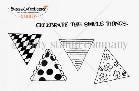
Here I used a wonderful stamp by Susan K. Weckesser that just captures the feelings the day "Celebrate the Simple Things"
Here you can see some other texture applications I used in the cluster to add interest.
- Paint Splatters
- Stamps
- Layers of paper
- Inked edges of paper
- Distressed edges of paper
- Metal bits
- Crackle paint on chipboard
- Flower soft
- Rubons
- Items with texture already like the flowers and the jute.
- Mists
- Paint Splatters
Supplies Used
Cardstock - Core'dinations
Patterned Paper - Prima
Number Stickers - Glitz
Rubons - BoBunny
Jute - Canvas Corps
Flowers - Petaloo
Wood - Prima
Chipboard - Memory Maze
Metal - Prima
Cork - Fancy Pants
Stamps - Susan K. Weckesser
Ink - Ranger
Punches - EK
Stains and Mediums - Ranger
You can also view this article at Susan K. Weckesser.
Enjoy!!


Erin, WOW! Love your page!!! The layering is great.
ReplyDeletethanks!
DeleteFantastic, I love the way you layer and the photo is amazing. The combination of the different textures, stamps and embellishments work together so well!!
ReplyDelete