Thursday, February 20, 2014

happy **Susan K. Weckesser**

I love to use flowers and girly things on my cards and projects, but sometimes I want something more masculine, especially if it's for my husband.  I find that a great substitute for flowers are gears, and there are so many varieties out there in chipboard, acrylic, stamps, stickers, and punches.  So here is a card I made for his birthday this year.


I am loving paint splatter right now, I seem to be using them in just about every project, but they really add to the dimension and depth to your paper for very little effort and cost.  I then on top of the splatters used some of Susan K. Weckesser stamps around the edges and borders of the card for more dimension and texture.  I kept to earth tone colors for a rustic look, I felt that it just added to the masculine feel.


I was not happy with any of the alpha letters I had on hand, they were not the correct size, wrong color, wrong font, etc.  So I took something that I like the size and font and altered the color.  These were foam "Thickers" in grey.  I pressed my distress ink by Ranger in a dark brown on top to give it a darker look and distress the letters a bit.


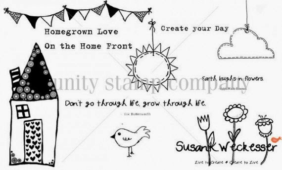
Here you can see some of Susan K. Weckesser stamps up close.  I used the "banner" and the "create your day" stamps.
http://www.susankweckesser.com/welcome


I love Susan K. Weckesser papers.  The a fun, flirty, and whimsical.  I took a small section of one of her papers to make these banners. 
http://www.susankweckesser.com/welcome


Play with your stamps and inks.   You can get such wonderful results by layering and just letting your project go where it needs to go.

Supplies Used"
Papers - Susan. K Weckesser and Core'dinations
Stickers - Glitz and American Crafts
Ink and stain - Ranger
Stamps - Susan K. Weckesser
Chipboard - Creative Embellishments
Twine - May Arts Ribbon
Staples - Ranger

Enjoy!!

Wednesday, February 12, 2014

Love Card **The Art Studio @ SNR**

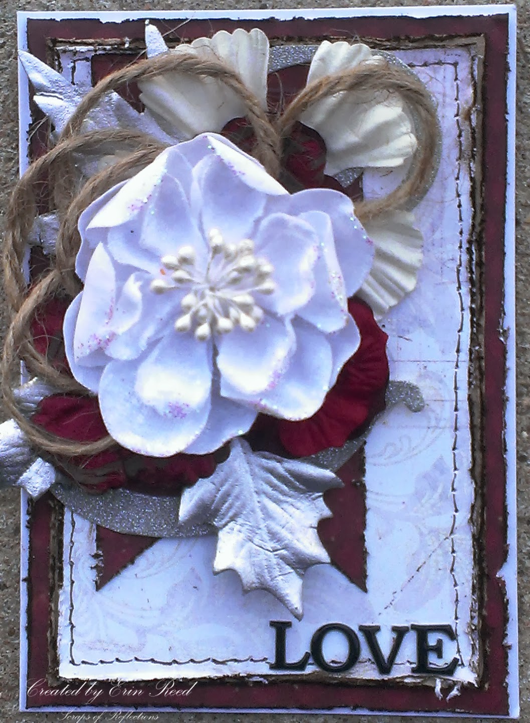
I have always been in awe of layouts and cards with wonderful layering and groups (or clustering) of items such as flowers, chipboard, trims, leaves and the like; so I have created many projects teaching myself how to create this same wonderful effect.  On this card, that I made for my parents anniversary, I will show you the thought process of putting together a cluster of flowers, jute, and leaves - a peak into the thought process of cluster creation.


First, start with the colors.  The wedding colors (as this is an anniversary card) were red, white, and silver, therefore the colors of the card came naturally.  I cut all the papers to size, distressed the edges with my scissors, and then inked them with dark brown distress ink.  I used a faux stitching technique with my pen around the white paper, and then glued everything down to my card (A2 size) so as I worked out the idea for the cluster the papers would not move around.


I took a portion of a 12x12 die cut silver glitter paper and placed it on top of the red banner as the base for my cluster.  This way my cluster is not free floating on my card.  You want to anchor your cluster to something, the corner of a picture, along a swirl, the edge of layers, and not just free floating on your page or layout.  I started with my cluster with a bow tied in jute, this gives such texture and contrast to the cluster.


At this point I started playing with different flowers and leaves that I had pulled from my stash that were the colors for the card.  I had pulled about 20-30 different flowers and leaves so I had plenty to play with knowing full well that not all were going to make it to the final project.  I layer them on top of each other, play with where they are placed, see if it looks good, if not I move it around or stop using it all together.  None of the flowers, leaves, or jute are glued down in this process so I can play as much as I like.


At this point I am not liking the way the smaller white flower on top looks. There is too much red and the smaller flower looks swallowed up by the cluster.  I changed it to the larger white flower, and it looks tons better.


Now the ribbon jute looks to small, you can't even tell it is a bow.  I could either change the bow to a different type of trim or ribbon or change tactics.  I played around with the jute and looking back at the previous picture I liked the loopy feel of the bow at the top of the white flower.  I made more loops and place the flower on that, awesome!


Much better, the loopy jute looks great.  Another part that bugged me were all the red flowers grouped together, you could not tell there were three separate flowers since they were so close in color.  So I brought the larger white flower from the back up in front of two of the other red flowers to break it up.  I also added a brad to the smaller red flower to attach it to the large white flower to make them a unit, this made it much easier to arrange the cluster (less individual pieces shifting around).  At this point I take a picture with my phone (just a quick snapshot) to see what the final look will be so as I take it all apart and start to glue it all down (I used a good craft glue like Martha Stewart craft glue) I can see where each part goes, no guessing.


Head on over to The Art Studio @ SNR to see more great creations!! 
 http://theartstudio.scrapbooknewsandreview.com/index.php/cool-stuff/blog/entry/how-to-create-layers-and-clusters


Supplies
Cardstock - DCWV
Specialty Paper -  Imaginesance and CartaBella
Letter Stickers - Momenta
Embellishments - Prima and Canvas Corps
Ink - Ranger
Pen - Faber-Castell
Brad - Recollections
Adhesive - 3M and Martha Stewart

Enjoy!!
 

Tuesday, February 4, 2014

It's a Boy **Susan K. Weckesser**

 I have a baby shower that I am going to this weekend, and it is for a boy!!  I love to make handmade items for people on special occasions such as this, so here is my special card for such a special baby.
 

I just love the colors of teal, turquoise, tan, and white - it looks so clean and fresh, just what I think of new babies.  I had fun with all the layers and textures here, from die cuts to ribbon, flowers, chipboard, and Susan K. Weckesser Stamps.

http://www.susankweckesser.com/welcome

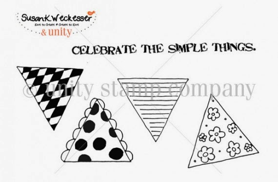
I used the horizontal line triangle stamp from the "Celebrate the simple things" stamp set by Susan K. Weckesser, stamped it in light brown ink on tan Core'dinations paper and then cut it out and place it in the background of the card.  I added a bit of twine from May Arts Ribbon across the top of the triangle banner and added little knots to the end.


I then took the "Create your Day" stamp from the below stamp collection by Susan K. Weckesser and stamped just the "your day" portion of the phrase around the card in random places, as it is the baby's day for he is about to be born (and also for his parents).

http://www.susankweckesser.com/welcome


Supplies Used
Cardstock - Core'dinations
Patterned Paper - Simple Stories
Punch - Martha Stewart
Die Cuts - Spellbinders
Inks/pearls/glitter - Ranger
Ribbon/Fibers - May Arts Ribbon
Chipboard - Memory Maze and Other
Stickers - Momenta
Flowers - Prima
Brad - Recollections
Stamps - Susan K. Weckesser

Enjoy!!

http://scraps-of-reflections.blogspot.com/

Monday, February 3, 2014

Thankful for You **The Art Studio @ SNR**

I am always on the lookout for uses for my mists - I just can't get enough of them.  I love the look and ease of application (you can't mess it up), plus it adds great dimension and depth to your project. 


Here I used two different types of papers to change the color or add color by using mists.

First is coffee filter paper.  It is exactly what it sounds like, a paper make of coffee filter material.  You can buy it as doilies or you can cut up real coffee filters and use those.  The absorb mists really well and don't harden up like regular scrapbook paper after it has gotten wet and dried.  On this filter paper i used varying colors of red, yellow, and orange.


Next I used corrugated paper, similar to cardboard, but it comes in a variety of colors.  This one started out as grey, but I wanted to liven it up so I misted it with red, orange, and yellow mists then brushed the top and edges with dark brown ink.


 I used both of these materials in the background of my card for texture and depth.  I love to layer and it is even more fun when I use my mists!!

Supplies Used
Cardstock - Core'dinations and DCWV
Patterned paper - Glitz
Specialty paper - Fancy pants
Embellishments (flowers and leaves) - Prima, Petaloo, and Recollections
Stamp - Inkadinkadoo
Ink - Studio G
Mists - Heidi Swapp and Dylusions
Ribbon - Canvas Corp and May Arts

Come check out more at The Art Studio @ SNR!!

Enjoy!!


Friday, January 24, 2014

foxy **Flamingo Scraps & Off the Rails** with splatter stain tutorial

  I used some fun pictures of myself that I took for a new head shot for postings, these were my favorite.


Sadly this is our last F4 as the Flamingo Scraps store is closing, so with that in mind I had a bit of fun with my items.  We got vintage buttons in mint, purple, and black, a chipboard wheelbarrow, a little range bird, and a wooden heart.  I used the little bird on a nest of burlap fibers, ribbons, and flowers and anchored it in the paint splatters from Ranger Distress stain applicators and the title (tutorial below) - because I am such a fox, hehe.


In my cluster next to the picture I used many of the buttons from the pack (one of each), the wooden heart, and the chipboard wheelbarrow tucked in under the flower and ribbons.


Paint Splatter Tutorial with Distress Stains by Ranger

1) Supplies Paper and Distress stains by Ranger - I am sure this works for other dauber type products I have just not tried them yet.  I figure this out by happy accident on this layout.


2) When you press the dauber bottle stain comes up to the top of the bottle, if you stop pressing an just turn the dauber over and touch the paper you get a circle as seen below.


3) If you ink up the top of the dauber just as in step 2, but this time tap the paper with the dauber you get splatter as seen below.  The harder the tap the more splatter effect.


4) If you hold the dauber tip to the paper and press the container to release the ink you get a puddle of ink on your paper - this could be good for drip effects if you lift your paper up vertically to let the puddle drip down.


5) If you press the bottle and tap you paper at the same time you are releasing ink and causing the splatter effect for a even more intense splatter effect.  Below are various intensities and pressure applied to the bottle of splatters I achieved.  


These splatters are super easy and super fun - I would just suggest to practice on scratch paper before doing it to your projects until you get the hang of it.


Supplies Used:
Papers - BoBunny and American Crafts
Ribbon -Really Reasonable Ribbon
Flowers - Prima and Petaloo
Buttons - Prima
Chipboard - Fabscraps and Other
Stickers - Momenta
Paint/Ink/Glitter - Ranger
Punch - EK
Found Items - Flamingo Scraps


Enjoy!!
 
Challenges:
http://creativeembellishments.com/blog/?p=1281

Thursday, January 23, 2014

my sweet girl **Susan K. Weckesser**

 For Catherine's first birthday we had a few pictures taken by a friend, and they turned out wonderfully.  This is one of the beauties that came out of that shoot.
 

I love the look of mixed media, playing with your embellishments, creating texture, looking around the page at all the fun different items, but never taking away from the picture itself.  That is part of the art, not letting the page "eat" the picture, but letting the page enhance the picture. 

You can also view my tutorial on how to create the paint splatters as seen in the left corner of the picture in white paint.

Below is my methodology of how I build a page - a peak into my head so to speak.  Sorry for the lighting on some of the pictures, I did not always have the best light available as I was building my page.

How to Build a Mixed Media Page

 1) I start with the papers.  I look for papers that correspond to my picture, I want to complement it, not fight with it.  I used my daughter's hair bow (since the rest of the picture is brown, flesh, or white I used those colors (pink, teal, white, etc).  The papers from Susan K. Weckesser were a perfect match, they just begged to go with this picture.

http://www.susankweckesser.com/welcomehttp://www.susankweckesser.com/welcome
 The "color burst" paper was perfect for the background, and then I added in the "bouquet" and "beautiful days" as layers.

2) I this point I have a sketch in my head of the design of the layout, I know I wanted the picture in the middle right, with elements going above and to the left of the picture.  I start pulling items that I think will work on my page, not caring about color, just the shapes.  Not all the items will make the cut and be used, but this gives my an idea if I like where I am headed.  Nothing is glued down, it is just my rough idea at this point.


3) I apply gesso to all the embellishments that need a change of color (except for the top lace it was white so it took color no problem).  The spray them with spray mist.  I used Tattered Angels mist in a couple of different shades of light pink. I mist them each 2-3 times to give them a good coat.  I also let them dry before each coat so they absorb the mist better.  I do this off the page so I do not apply to much mist to the background papers.


4) Now I add texture to the page.  I used stencils by Prima with gesso, added in my papers (distressing each layer of paper with scissors and edging them with ink) and trims, and for fun I added in layers of Snowtex.  I gives this wonderful bumpy texture.  I even took a couple of Susan K. Weckesser stamps and stamped in gesso below the picture and in the top left corner below the lace and stencil area.  I used two small phrases found on the stamps sets below "Celebrate the simple things" and "Don't go through life, grow through life"

http://www.susankweckesser.com/welcomehttp://www.susankweckesser.com/welcome


5) Now I start to add my embellishments back on.  I do not have the picture glued down yet, as I might still spray and I don't want to damage my picture.


6) I start to glue down items as I like to way the looks in that location.  I sometimes take pictures and step away for the page to see how it looks a hour later (especially if I am waiting for something to dry).


7) If I feel there are dead or blank areas, I will either add in another embellishment (or two) or add in more texture.  I did this just above the picture, it felt it was missing something so I added another bit of stenciled gesso.  I also sometimes move things around or change the item completely.  I just let the page go with the flow.  I don't fight to make it work, because I find it never looks good if I do that.


 8) One of the last steps is to go over the gessoed embellishments one more time with paint or chalk ink, sometimes both.  This help them pop out of the page a bit.  I might even add a bit more gesso to the items so they don't look to pink. it adds contrast.  I also leave some items plain, or without gesso like bling and such.  On this page I also added on some glitter via Stickles from Ranger in Crystal for a bit of sparkle.


 9) You can see some of the texture and the Susan K. Weckesser Stamp


Supplies Used:
Cardstock - Core'dinations
Patterned Paper - Susan K. Weckesser 
Flowers - Prima and Petaloo
Media - DecoArt, O'Leary paint, Liquitex,
Paint, Mist, Sprays, glitter - Ranger, Tattered Angels, Martha Stewart
Metals - Prima, Momenta,  and Other
Chipboard - Memory Maze
Stamps - Susan K. Weckesser
Mask - Prima
Trims and Lace - Other
Found Objects - Other

 Enjoy!!

Share This

Related Posts Plugin for WordPress, Blogger...